Kinjo
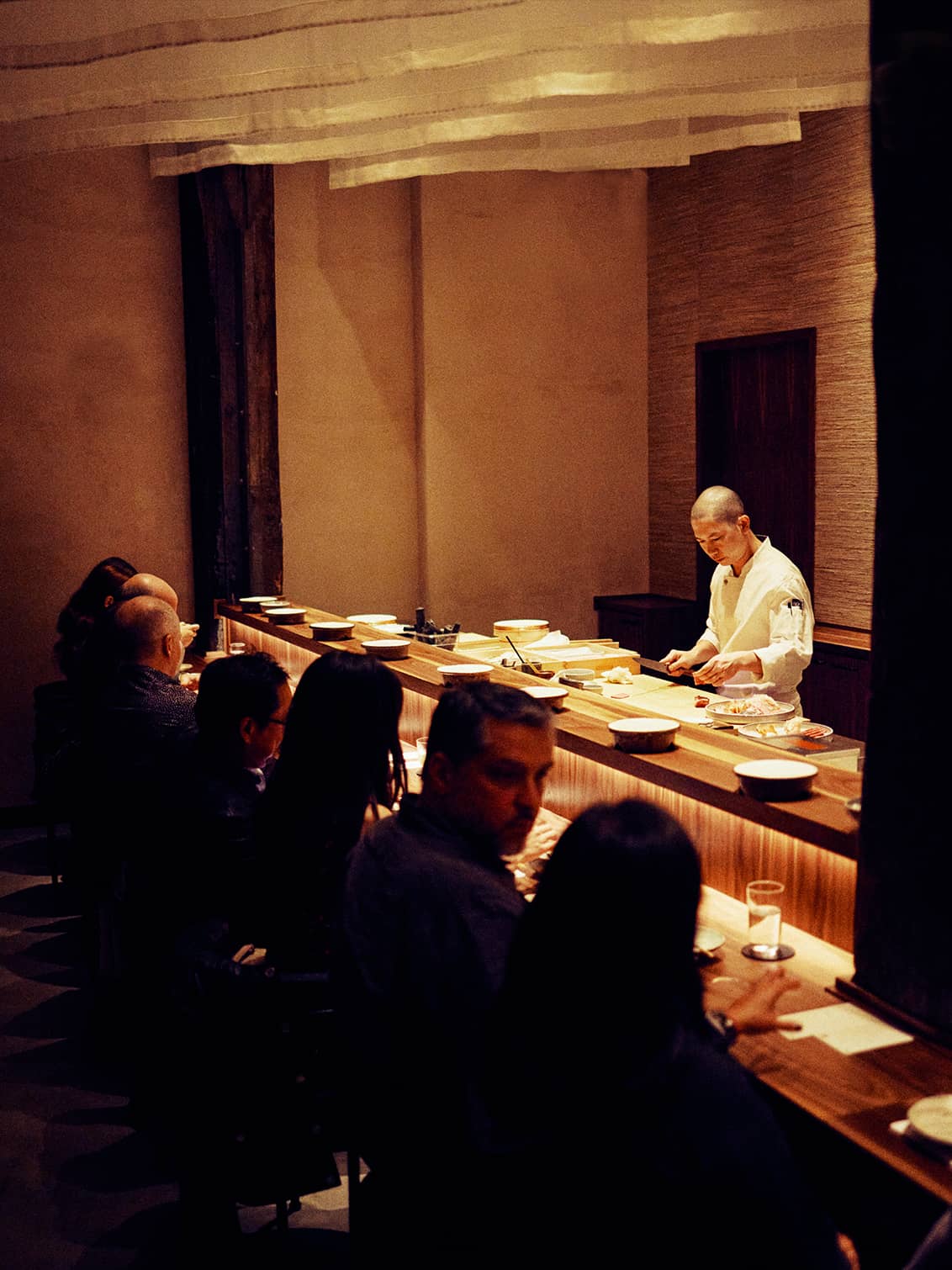
Kinjo means neighborhood in Japanese. Nestled under the Manhattan Bridge, Kinjo was founded as a new restaurant experience, one that balanced the sophistication of high-end omakase with the warmth and accessibility of a local neighborhood spot.
Team developed a brand that highlights Kinjo’s connection to Dumbo — its community, built environment, and storied history — while honoring the legacy of a traditional omakase experience.
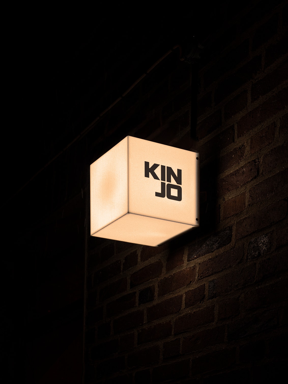
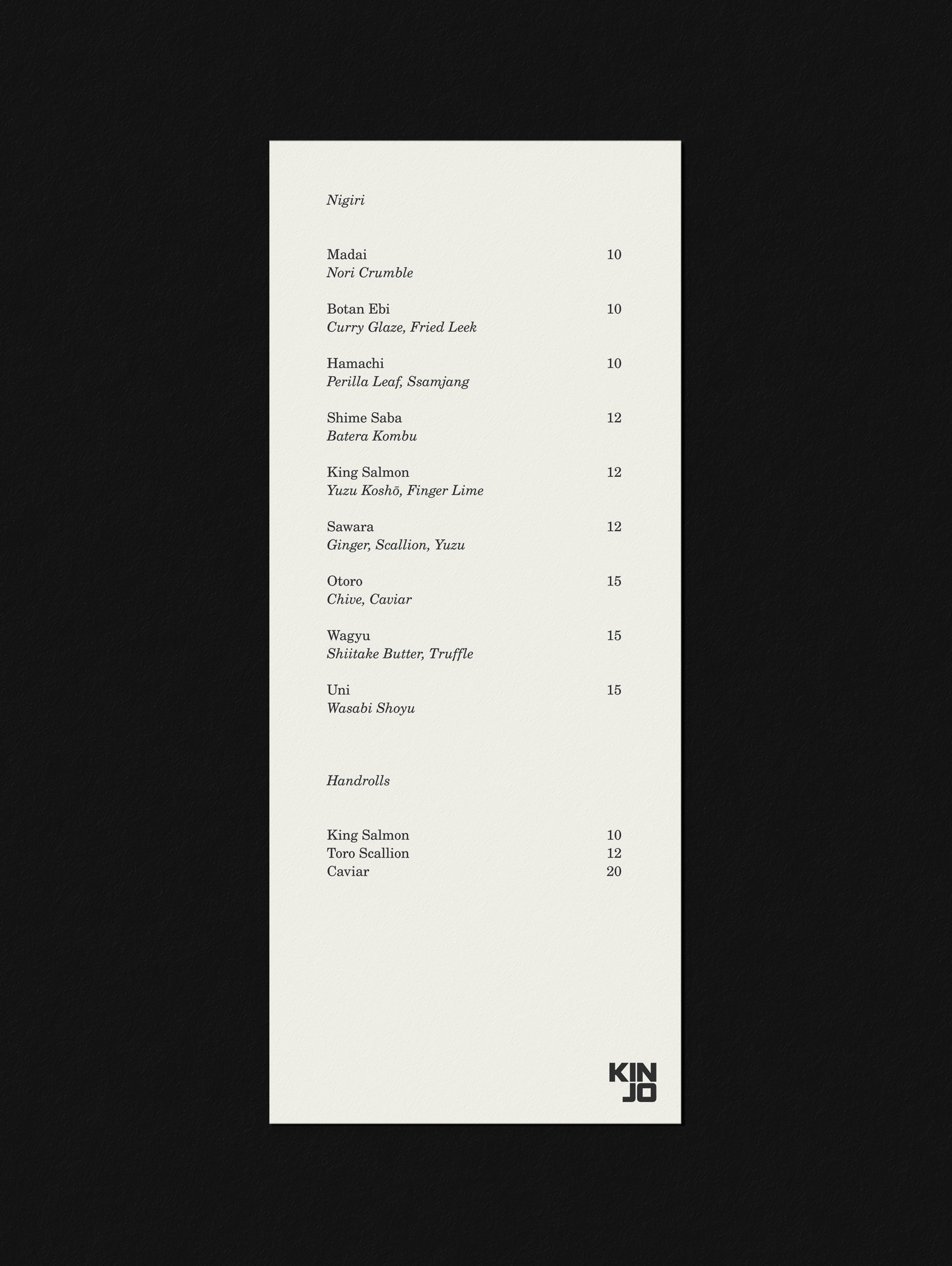
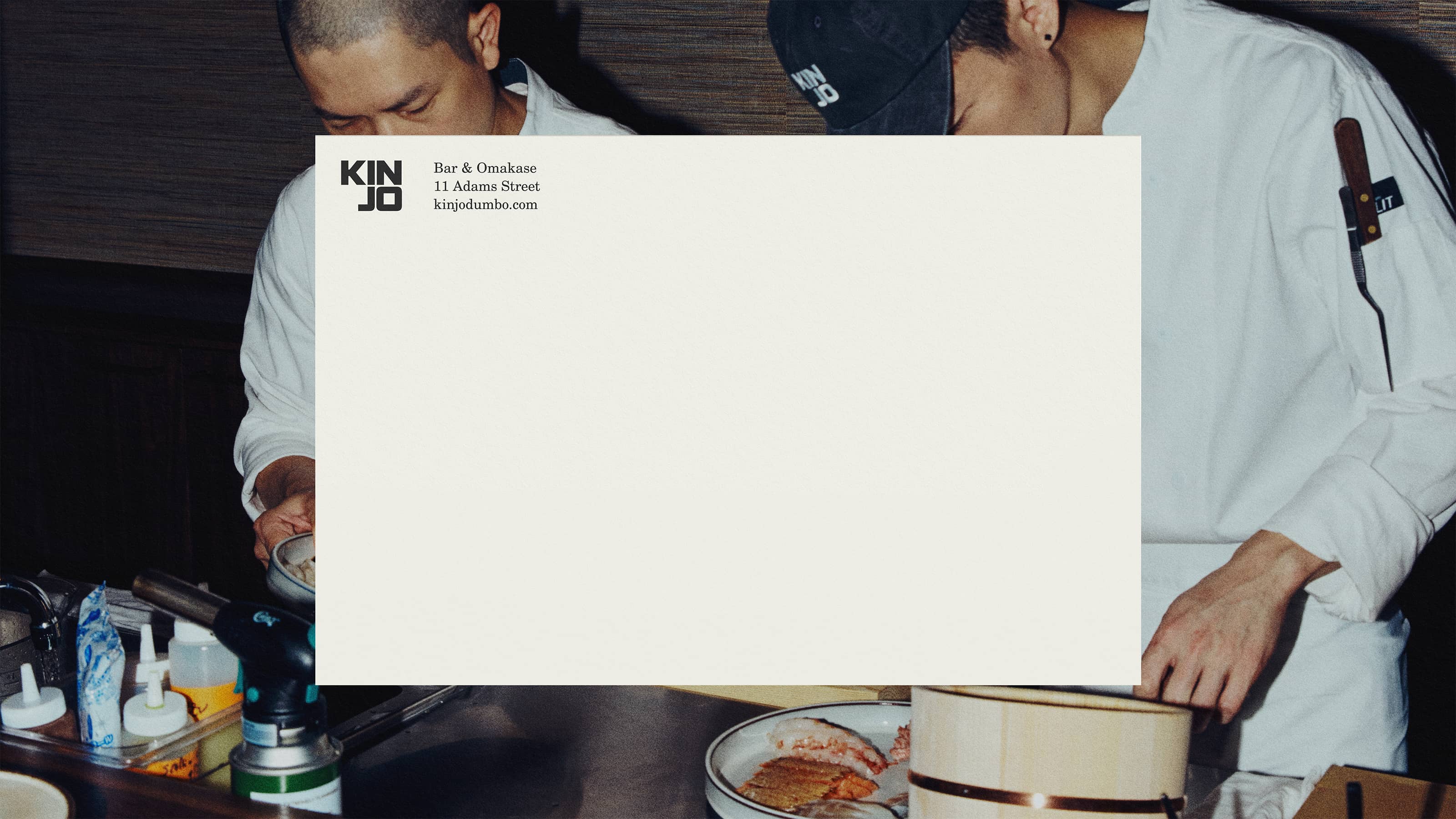
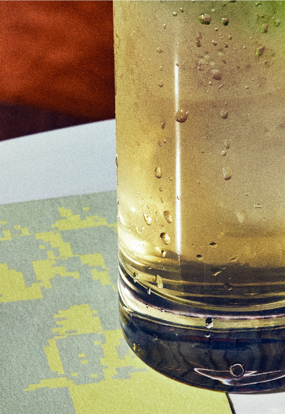
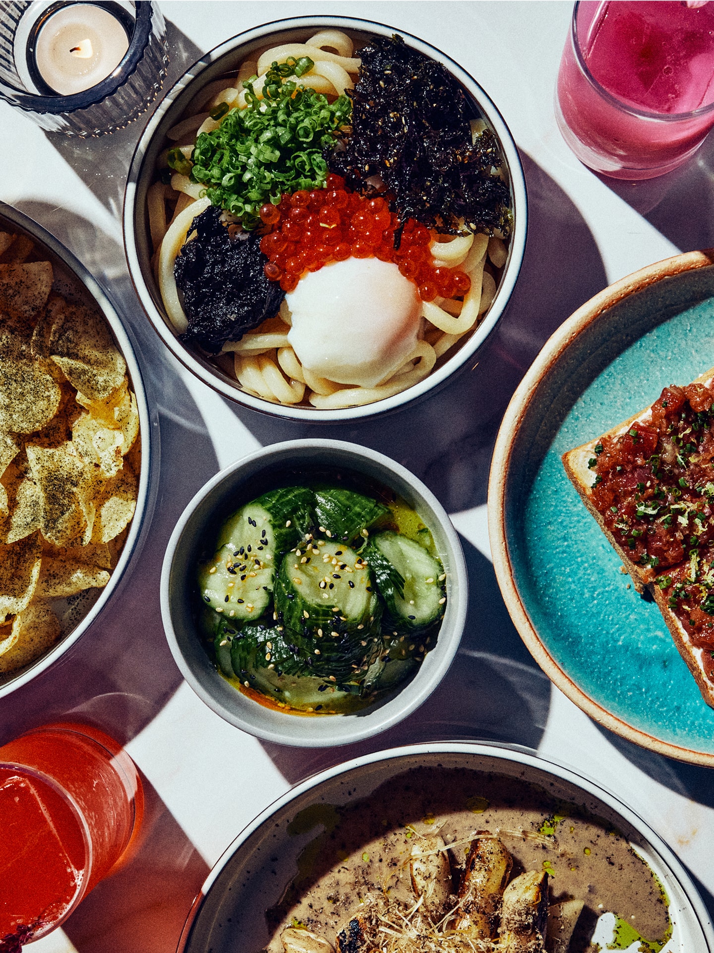
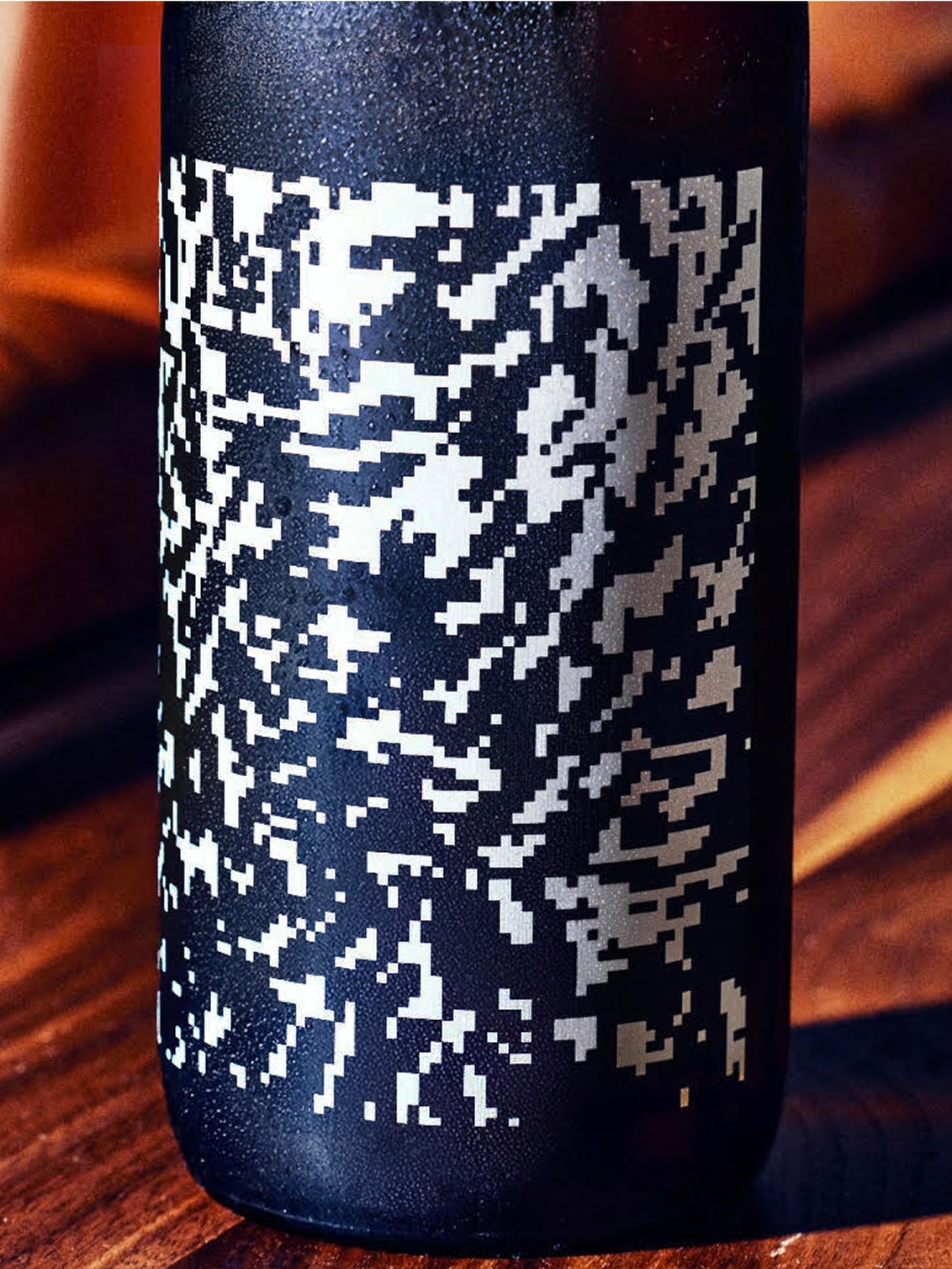
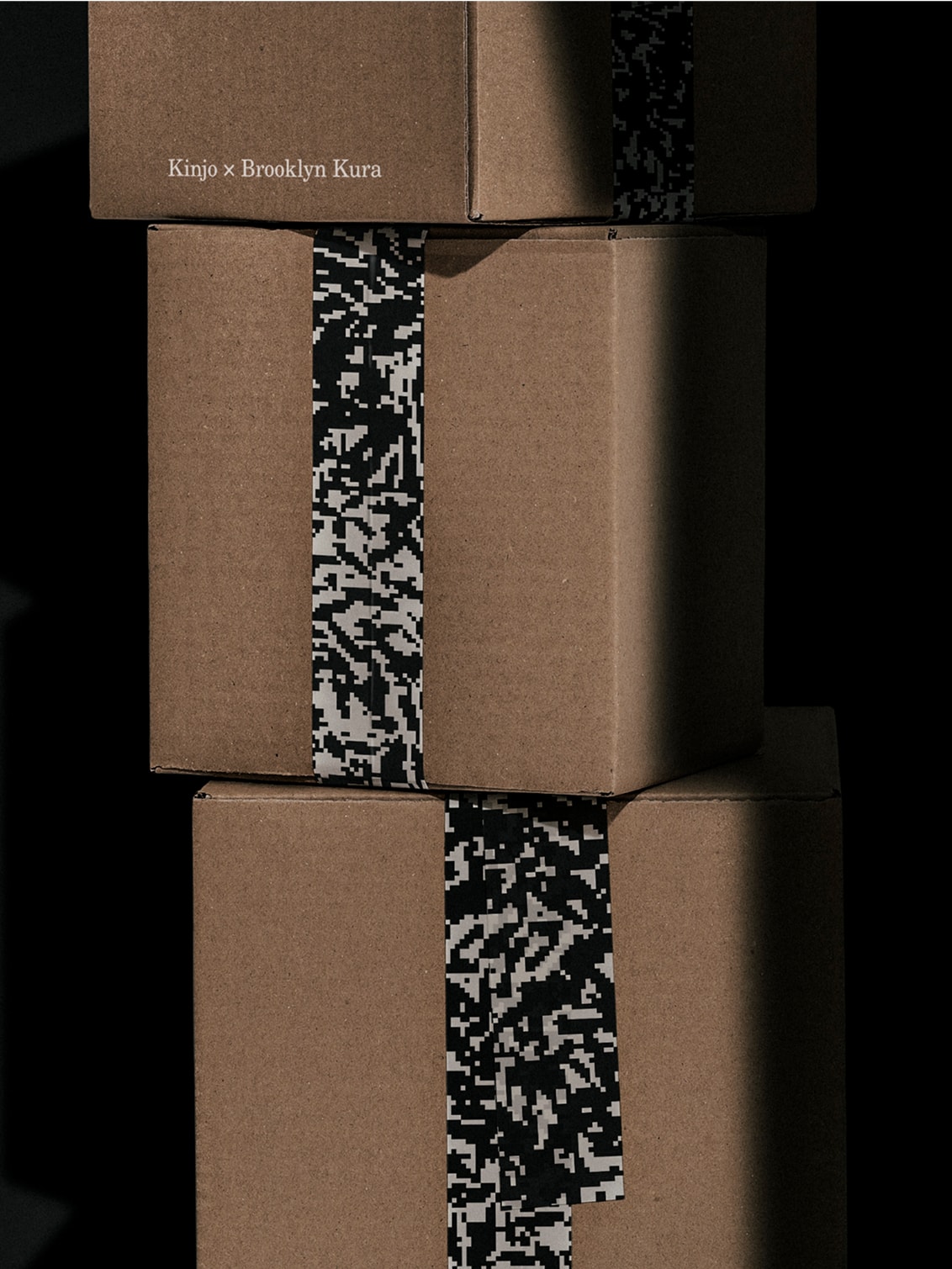
The visual identity centers around the Kinjo logo, a weighty two-line wordmark that nods to both Japanese linguistics (近所) and Dumbo’s industrial history. A symbol derived from Dumbo’s historic district boundaries reinforces the restaurant’s deep connection to its locality. Just as the restaurant offers a distinctive take on omakase, unexpected colors and abstract patterns — inspired by the irregularity of natural ingredients — counterbalance a restrained typographic palette.
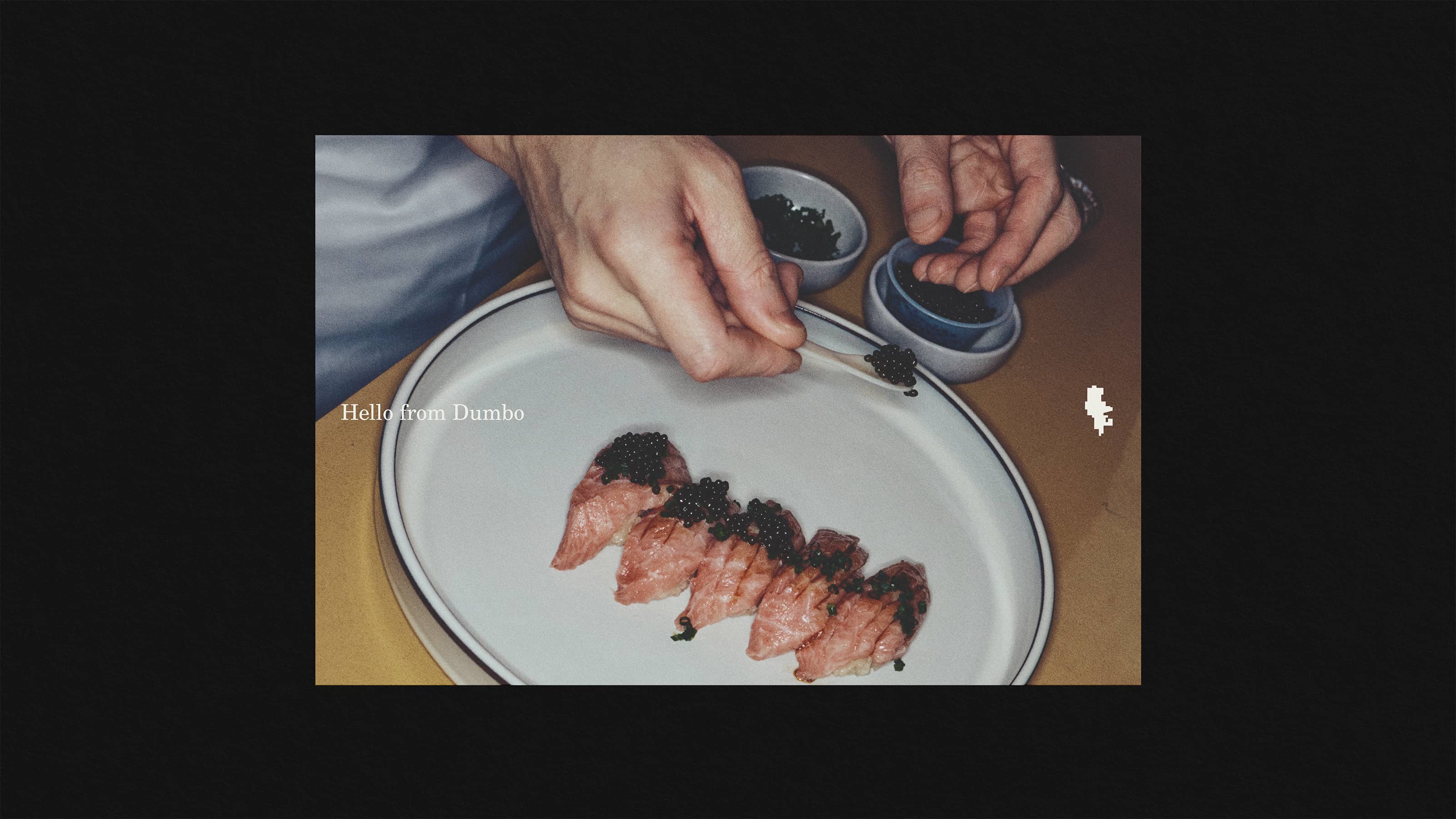
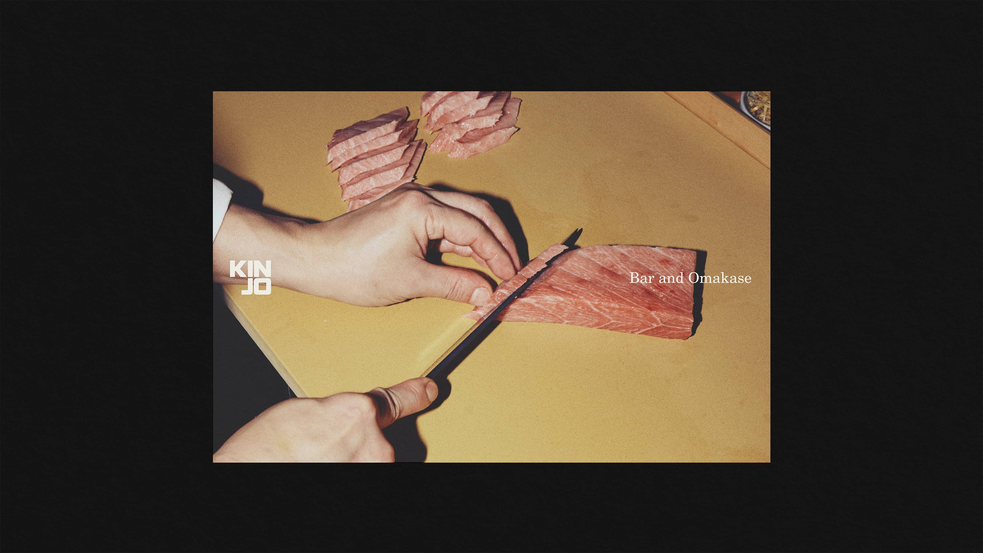
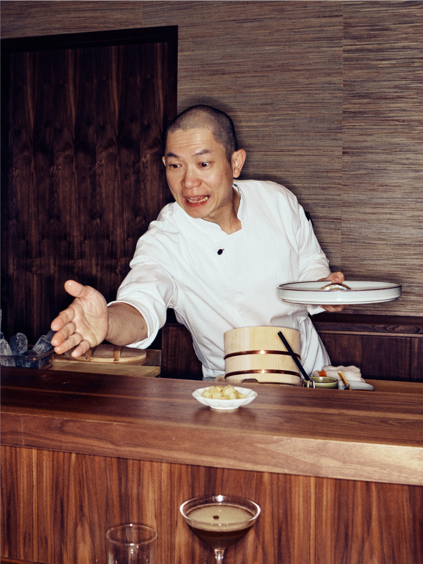
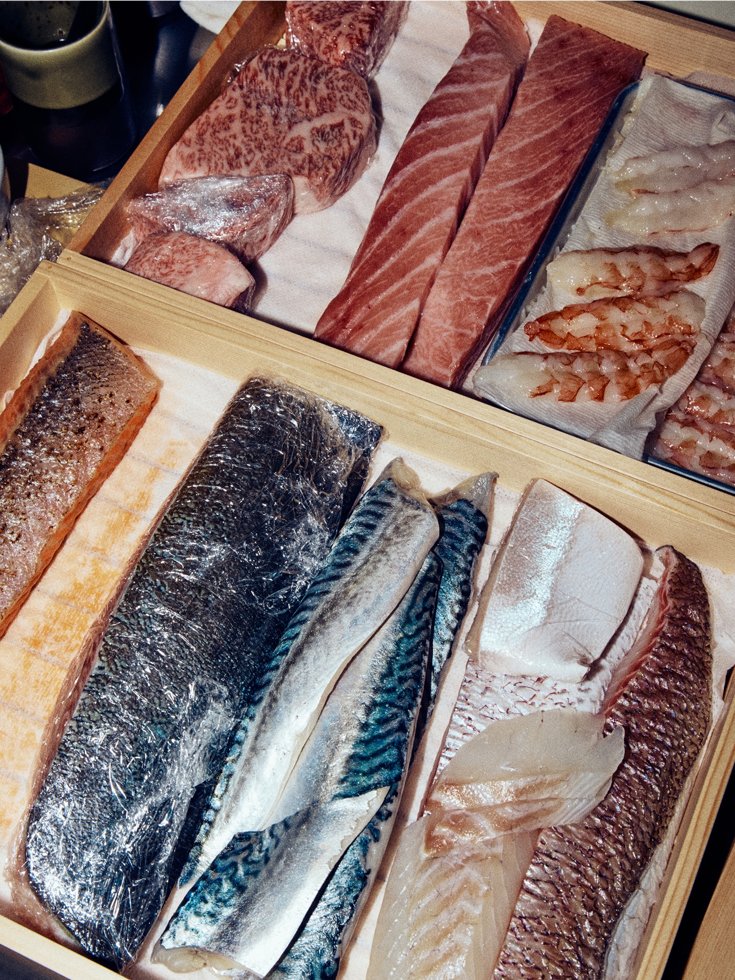
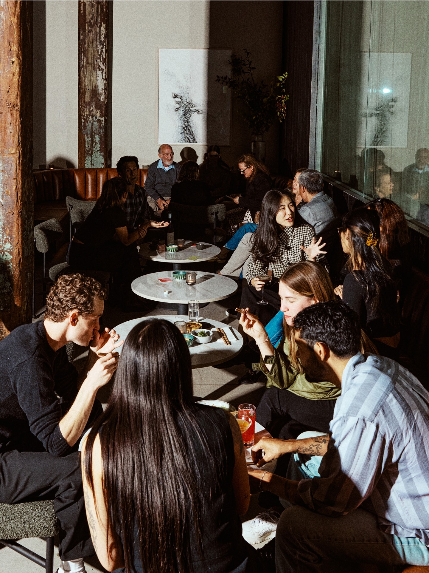
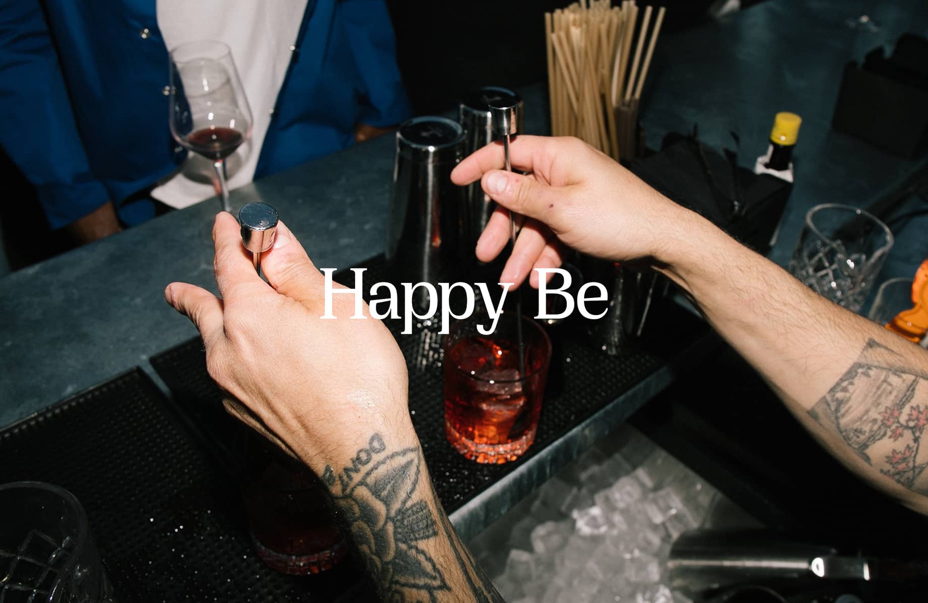
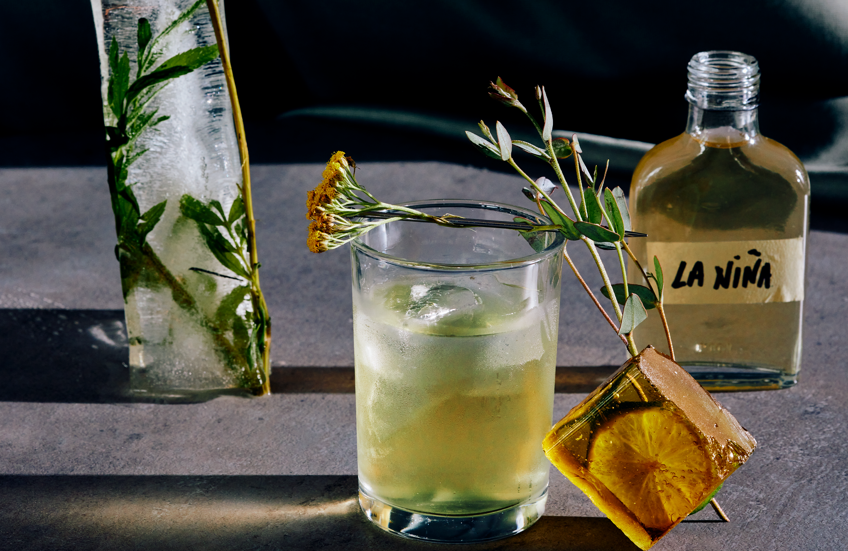
A candid, raw approach to photography deviates from the polished imagery typical of luxury dining to reveal the creative process behind the culinary craft. Curated artwork and refined interiors activate the brand in an intimate dining experience that connects the artistry of omakase with the energy and history of the neighborhood.
The new identity embodies Kinjo’s innovative community values, allowing the restaurant to distinguish itself in a well-established, tradition-based industry.
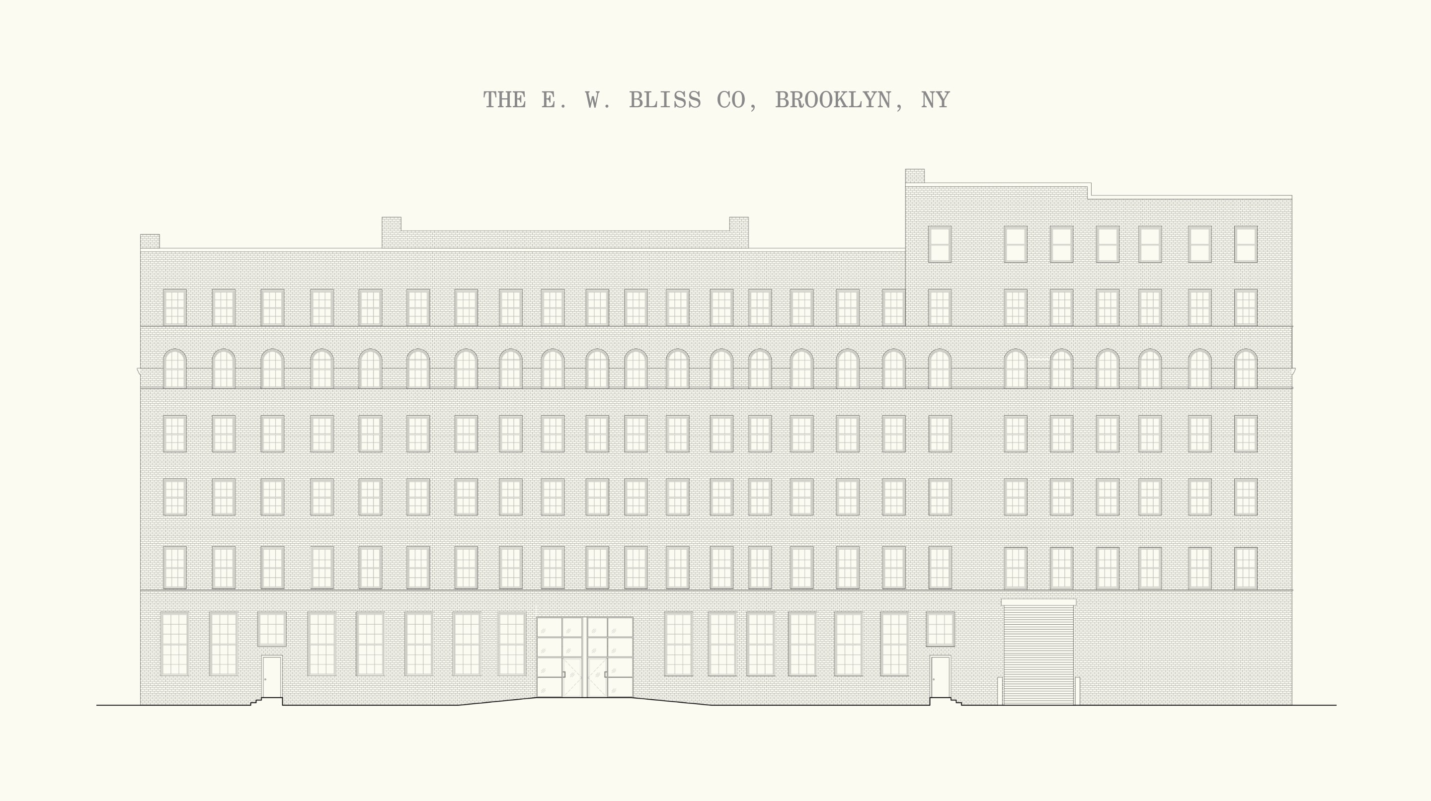
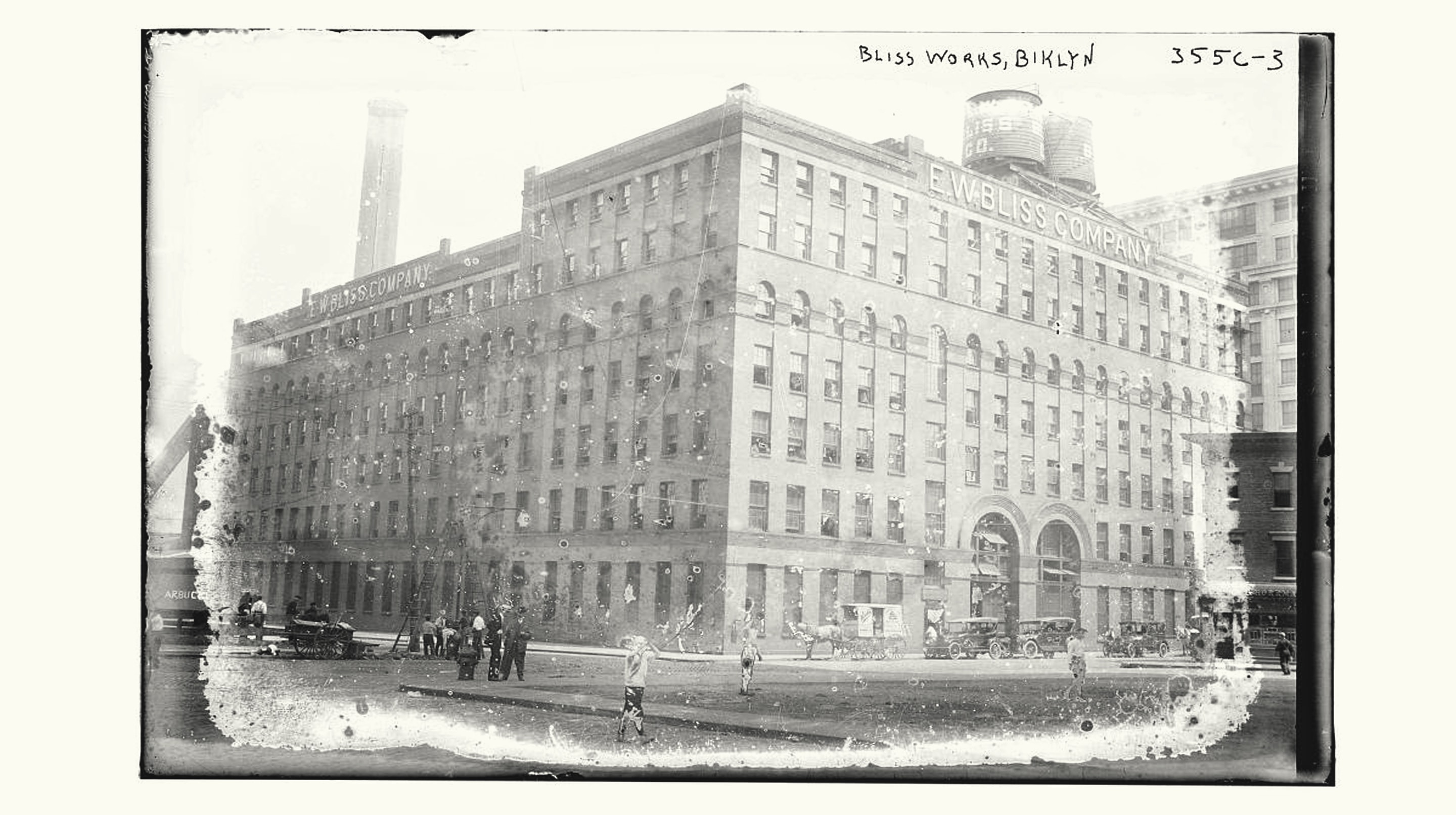
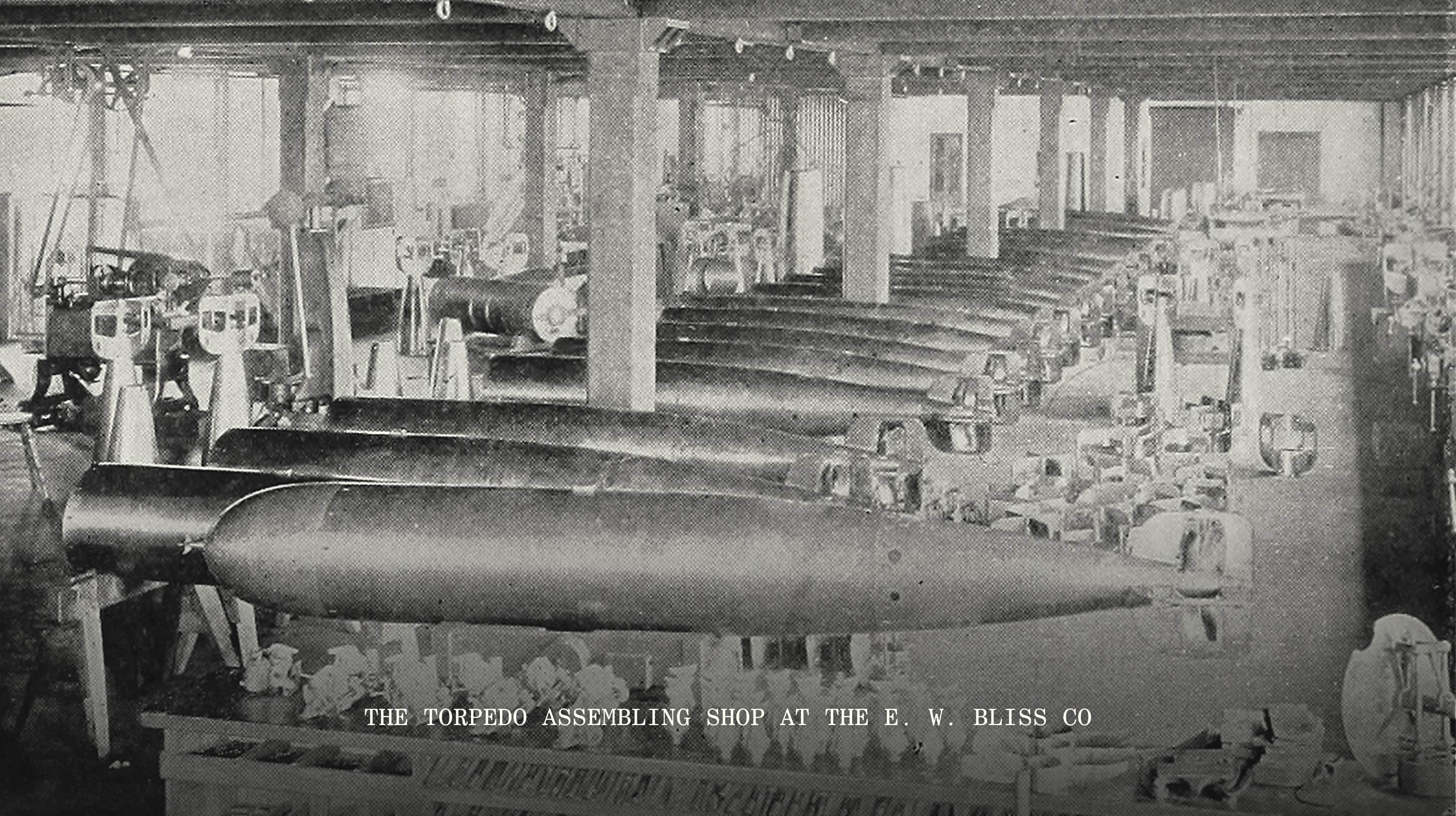
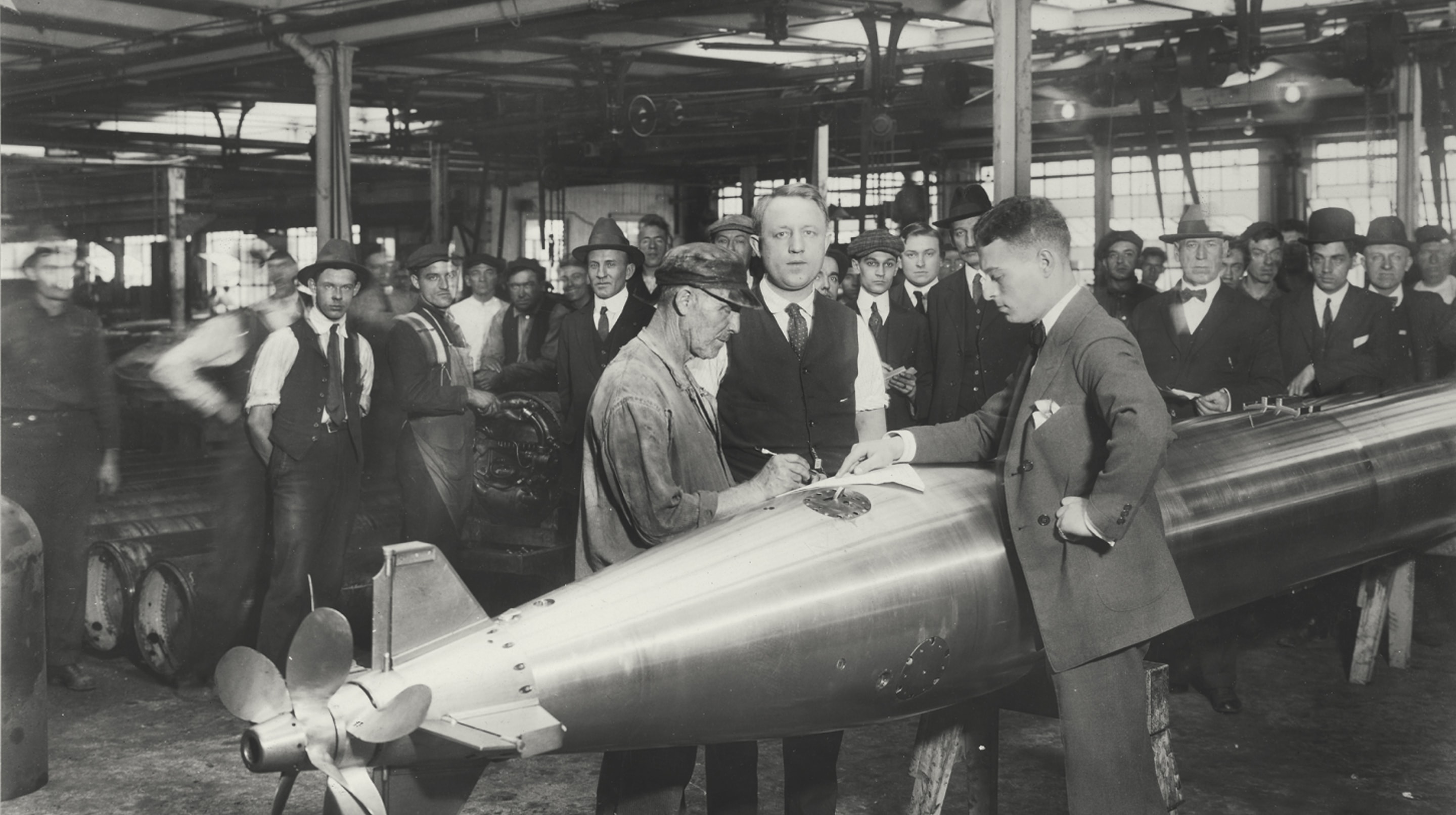
Kinjo is housed in a building that once belonged to the E.W. Bliss Company, a major torpedo manufacturer and one of Dumbo’s largest industrial firms.
The Kinjo logo, a weighty two-line wordmark, nods to both the industrial signage characteristics of Dumbo’s historic buildings and Japanese linguistics (近所).
The Kinjo Dumbo symbol outlines the boundaries of the neighborhood’s historic district, reinforcing the restaurant’s deep connection to its locality.