LSG
Today’s campaigns aren’t just won on Wall Street or on K Street — they’re won on streets like Locust Street in Des Moines, IA. As an integrated impact agency, Locust Street Group was founded on the belief that every voter and consumer has a voice. LSG partners with clients to solve their most complex challenges by amplifying and harnessing community voices to create meaningful impact.
Team created a visual identity that wove LSG’s approach, tailored partnership with human conversation, through the concept of voice and sound.
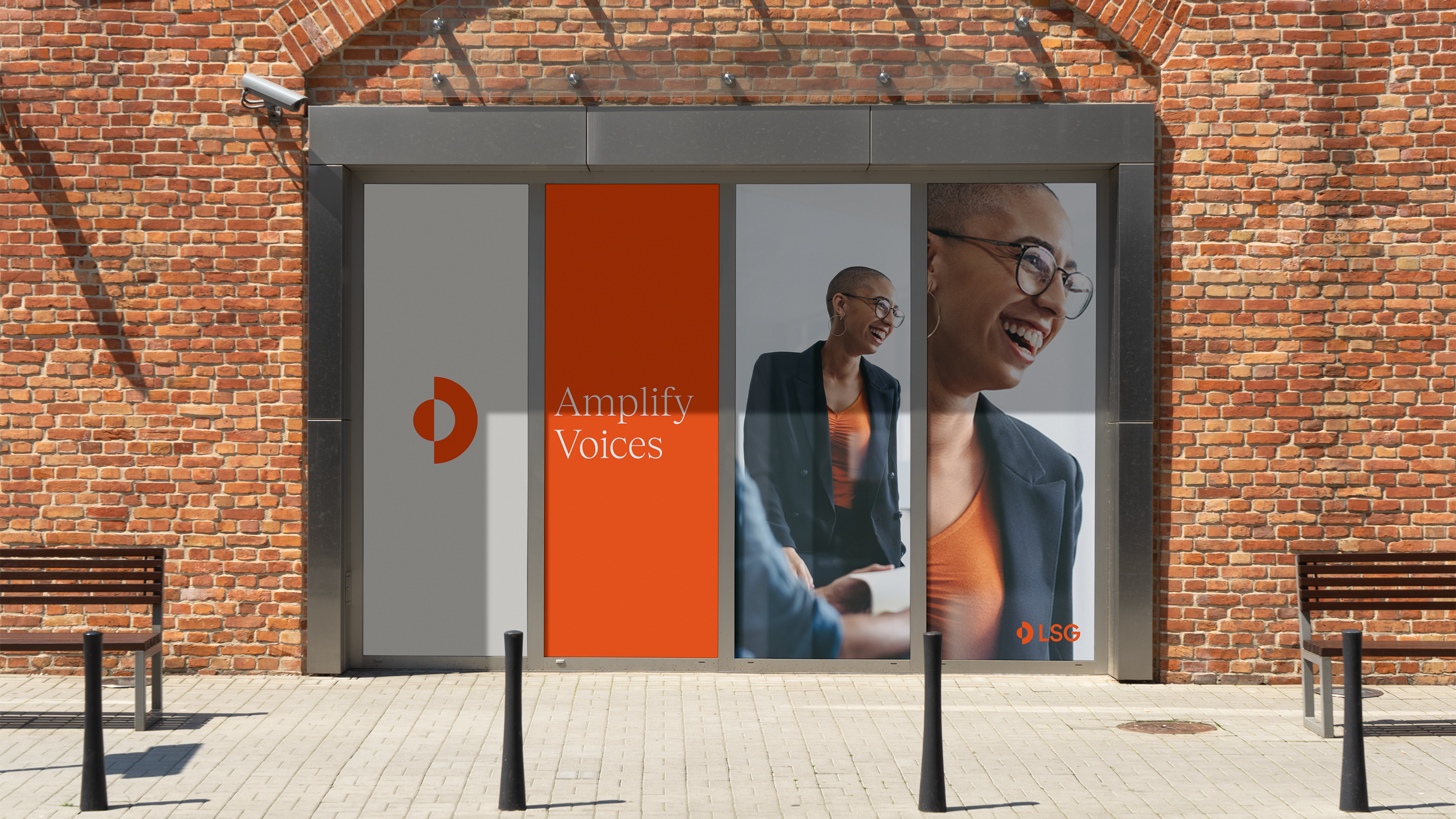
The logomark explores a visual representation of sound projection and reverberation. Just as a single consumer’s voice can create a ripple effect, the outer ring acts as an abstracted sound wave projecting outwards, while the two half circles link LSG and its partners in collaboration.
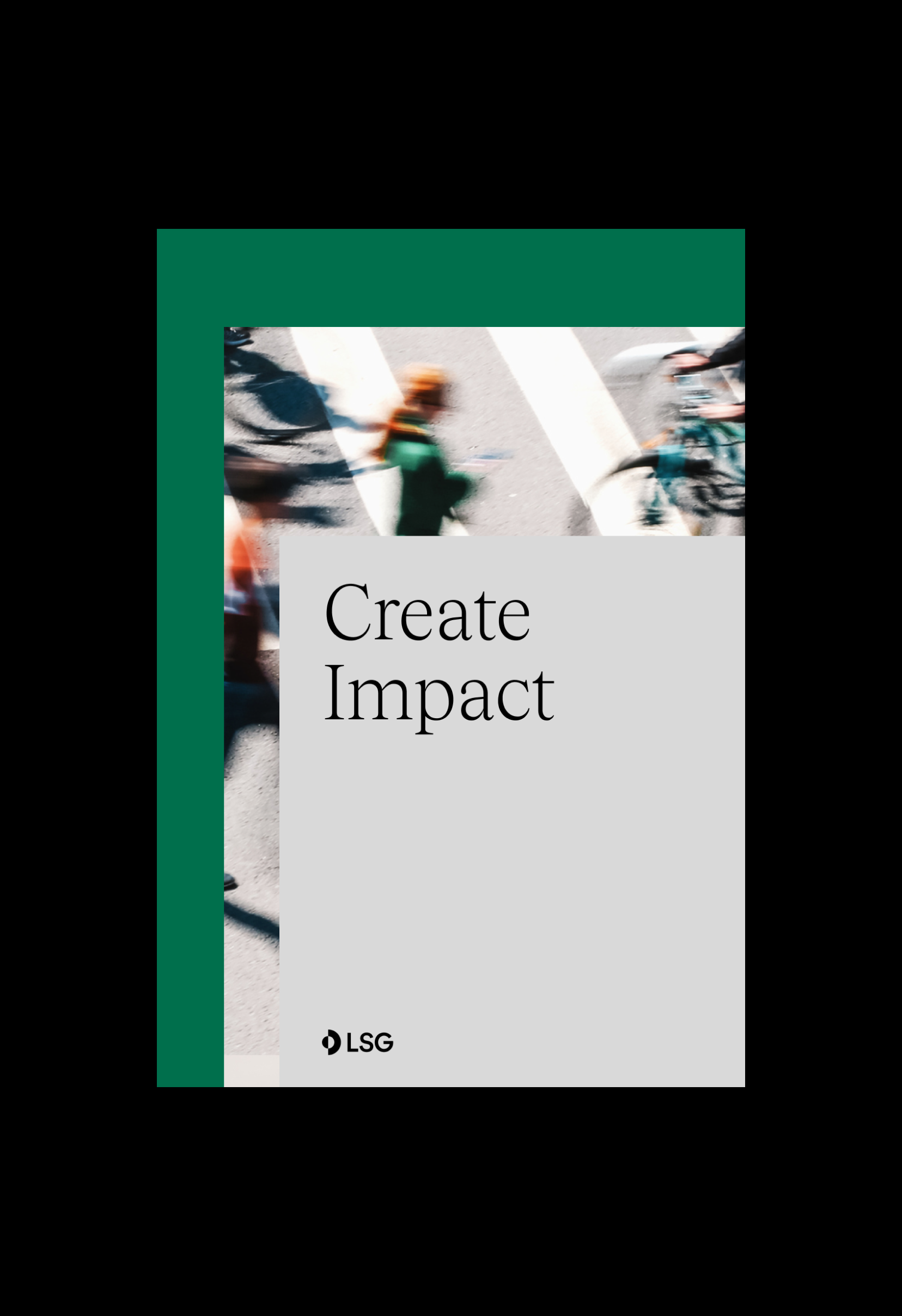
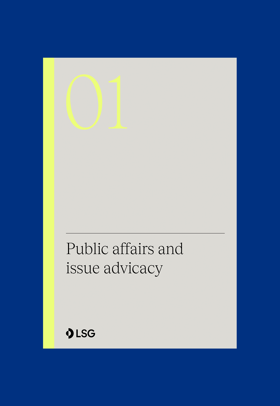
An expansive palette allows flexibility in representing LSG’s diverse offerings, from corporate affairs to issue advocacy. The pairing of deep bold colors with pops of bright tones evokes a sense of assurance with a contemporary feel. To convey LSG’s depth of expertise, the primary typeface, Tobias, offers a sense of elegance with its serif flourishes. Basic Grotesque complements the brand expression with a welcoming, geometric shape to create a balanced visual language — dynamic and engaging, yet matured and trusted.
The brand system further reinforces LSG’s unique approach to communications. Using layering, scale shifts, and a Fibonacci grid, every graphic element communicates the concept of amplification, reflecting the diverse multitude of voices from even the hardest-to-reach audiences.
The result is a brand that is refined, inclusive, and comprehensive as experts in solving the most complex communications challenges with human connection at the core.
